0000000000 CHRIS SINDERSON 0000000000000000000000000000000000000000000000000000000000000000000000000
0000000000000000000000000000000000000000000000000000000000000000000000000000000000000000000000000000
00000000000000000000000000000000 ANIMATION 000000000000000000000000000000000000000000000000000000000
0000000000000000000000000000000000000000000000000000000000000000000000000000000000000000000000000000
00000000000000000000000000000000000000000000000000 COLORING 0000000000000000000000000000000000000000
0000000000000000000000000000000000000000000000000000000000000000000000000000000000000000000000000000
00000 NEWS 00000000000000000000000000000000000000000000000000000000000 ABOUT 00000000000000000000000
0000000000000000000000 COMICS 0000000000000000000000000000000000000000000000000000000000000000000000

Monday, December 8, 2008

Austin American-Statesman Illustration


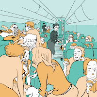
Here's an illustration I colored last week.  It was drawn by Nick Bertozzi and appeared in the Austin American-Statesman this past Saturday.  (If you follow the link, beware that the image posted on their website has some color issues depending on which browser you are using.)  Nick already had in mind the hues he wanted to use, but left it up to me as to whether to add highlights and lowlights or not.  The one above is the one he ended up going with.  Below are a couple variations, one with alternate hues and the other a flat image without highlights and lowlights.

No comments: